A remote coach app is a mobile application that connects clients with remote coaches for coaching services.
The app includes features such as video conferencing, messaging, goal tracking, and payment processing.
Remote coach apps are designed to make it easier for clients to find and work with coaches remotely, as well as
to manage their coaching sessions and progress.
I assumed the following roles designing this app:
Interaction Design: High-fidelity interactive prototypes for key tasks on iOS
Duration: 6 weeks
Tools
During the COVID-19 pandemic, when many people were left jobless and struggling to make ends meet, the concept of remote coaching emerged as a lifeline for many professionals, including fitness coaches. As face-to-face interactions became difficult, coaches started offering online sessions through various platforms. However, many of these platforms were plagued with problems such as high costs, automatically enabled services, and hidden fees, making it difficult for both coaches and clients to manage their finances effectively.
Despite these challenges, remote coaching has proven to be an effective way for coaches to connect with clients from anywhere in the world, and for clients to receive personalized coaching services at their convenience. As the world continues to adapt to the new normal, remote coaching is likely to become an increasingly popular and important aspect of the coaching industry.
The executive intent of the Remote Coach is to empower individuals by providing them with convenient access to professional fitness coaching and guidance. Our goal is to revolutionize the way people approach their fitness journeys by leveraging technology to bridge the gap between coaches and users, regardless of their location or schedule limitations.
My research first centered around the
Competitive research and user surveys.
Competitors were analyzed, highlighting features like personalized workouts and nutrition tracking.
User surveys revealed that convenience, personalized guidance, and effective communication were key factors. Integration of workout tracking, nutrition management, and goal setting were also identified as important.
These insights guided the design and feature prioritization of Remotecoach, ensuring it meets user expectations and stands out in the competitive landscape.
Superficially, it may appear that everyone interested in a remote coach app has the same goal of saving time and achieving their fitness goals.
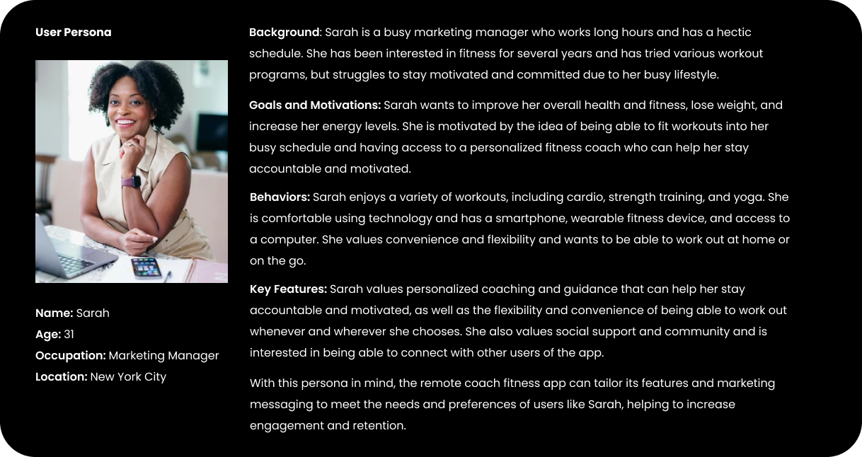
However, upon closer examination of user research, it became clear that there were divergent motivations among users. To address these differences, personas were created to represent distinct user types. Throughout the research and design process, two personas received primary focus.
One persona emphasized the importance of scrutinizing usage reports and data to make informed decisions about their coaching subscription. The other persona relied heavily on the app's browse, search, and filter functions to explore and choose from a variety of available coaches. These personas served as valuable reference points, ensuring that the development of the remote coach app catered to the diverse needs and preferences of its user base.
By creating and exploring the journey maps of two personas and their typical tasks, I uncovered key emotional/procedural moments that OneStream needed to address.
Rapid sketching allowed me to explore design patterns common among apps in the competitive landscape, helping me understand which needed to carry over into OneStream to ensure familiarity.
Low-fidelity prototype testing allowed me to better understand how users expected to complete the tasks I was focusing on. By studying their touch and swipe gestures — and more importantly, having a dialogue with them about what they expected and when — I knew which adjustments needed to be made to lay the foundation for a more fully realized high fidelity prototype. Small details such as actionable and consistent iconography, and consistent paths to get back, would become important elements of the design system.
Visually articulating all potential aspects of the OneStream brand (product, as well as marketing and beyond) meant defining a baseline design system that identified key elements of its visual vocabulary. I wanted OneStream’s visual design to always refer back to its core mission: Empowering streaming services customers.
The high-fidelity prototype brought test users closest to the real experience yet, and it revealed some issues. While users were able to complete the onboarding experience, the realistic nature of it revealed some apprehension.